

When we apply branding, the selection of font may influence the viewers having a pleasant or an unpleasant impression about the whole brand. Typing is one of the most significant elements in design. Which in that manner makes a big difference in displaying the personality, tone and message of your brand. In the following post, we will consider what should be the font style you choose the right font for branding and provide you with some tips to guide you in getting the decision right.
Understanding Font Personalities
Fonts are not just a collection of letters and the symbols; they have their own personalities and generate special emotional or connotations with the words.
For example, is the serif font like Times New Roman and Georgia use to convey the tradition, elegance and formality. It is one that evokes a sense of modernity, cleanness and simplicity when used are the sans-serif fonts like Arial and Helvetica.
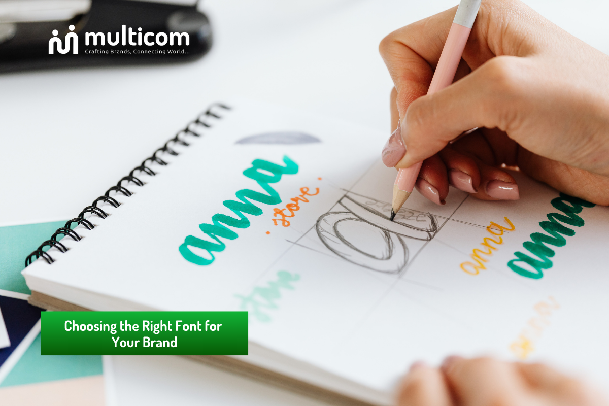
Scripted words, on the other hand, can be a great asset in giving a sense of class and refinement to your publications. But only if employed in moderation considering the visibility issues.
In line with the brand’s generic identity
The type of font you are using must correspond to your brand’s image and identity. It should composite your brand’s virtues and the group of your target audience. In case you are a luxury brand, you can prefer a classy serif font. That has a lot of boutique effect to present your nice point. On the contrary, an IT start-up could utilise a fresh, modern san-serif font. That would be in line with the company’s styles of innovation and simplicity. For a brand that is after the younger crowd. They can have a playful, handwritten lettering to depict a more lightweight and fresh feel.
Consider your brand’s personality for the right font for branding
- Evaluate your target audience: Which fonts, then, do you think will be likely to make contact with them?
- Analyse your competitors: Consider font usage whether it will be different or not from others and what type of font will please your audience.
Readability and Versatility for the right font for branding
However, concurrent with good looks, the font’s legibility and invariance must be taken into stride as well. Legibility at all sizes is a very important factor for every font, both when it comes to printing on paper and displaying it on screen. It’s not urged to use ornamental or abbreviated fonts since they have unusual characters, which may be awkward to read. Thus, the body text would not be the best to use them.
- choose fonts with excellent legibility, in particular for body text accordingly.
- For tying the share denominator of the font, the size and weight are equalise (check).
- The font is one of the versatile aspects of the product. It is visible (e.g. website, print materials and social media).
Regularity and Branding Guidelines
After you pick up the typeface fitting your brand, the key point is to keep it staying homogeneous in all marketing and communication materials. Prepare a brand style guide containing the best fonts, sizes and usage conventions as well that employees must adhere to.
At Multicom, we understand the importance of typography in branding and we’re dedicated to helping businesses like yours select the perfect font that aligns with their unique brand identity.